
I was asked to create a logo for a new upcoming brand Sovirez
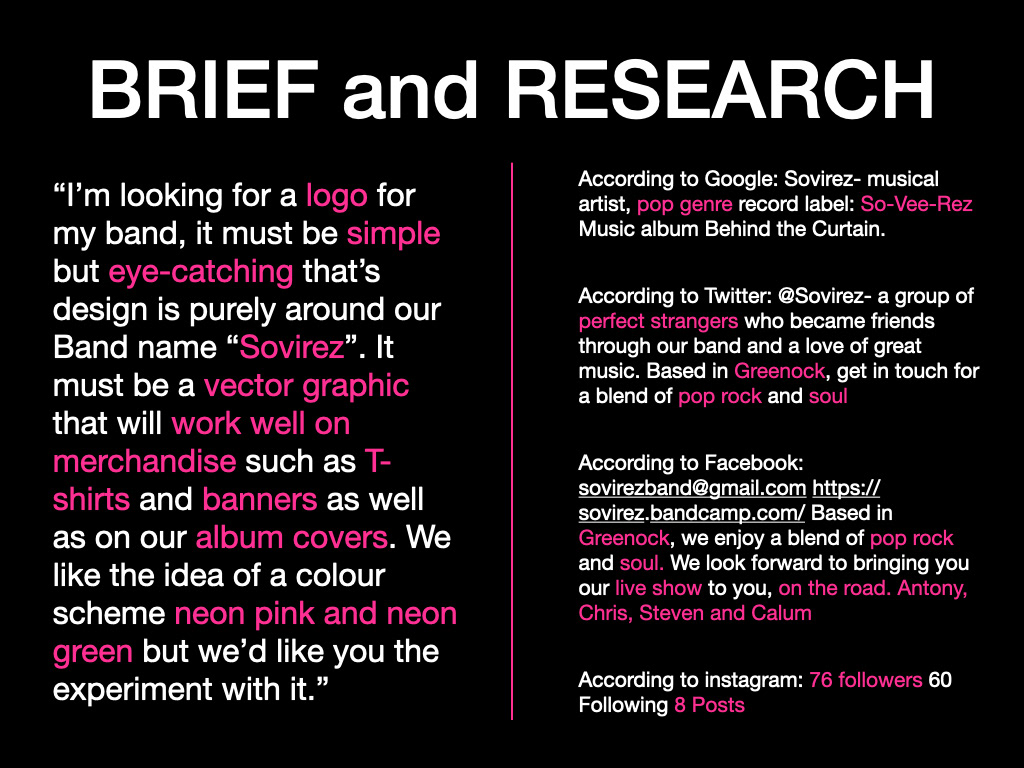
They knew roughly what they wanted so I managed to get a basic brief from them but they still wanted me to experiment and see what I could come up with.
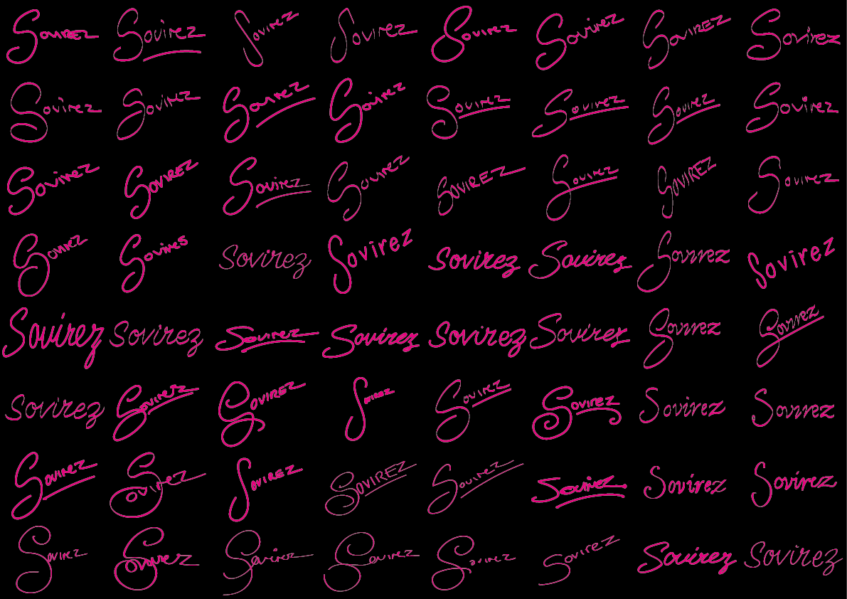
I sketched out 100 variations in my sketchbook then created computer mock ups based on the ones my client liked from my sketches.
I scanned in the chosen sketches of the logo and digitally translated them to make them more clean and precise
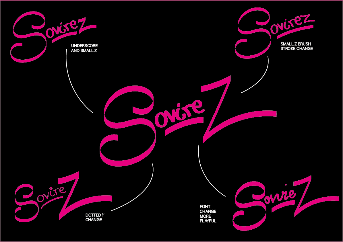
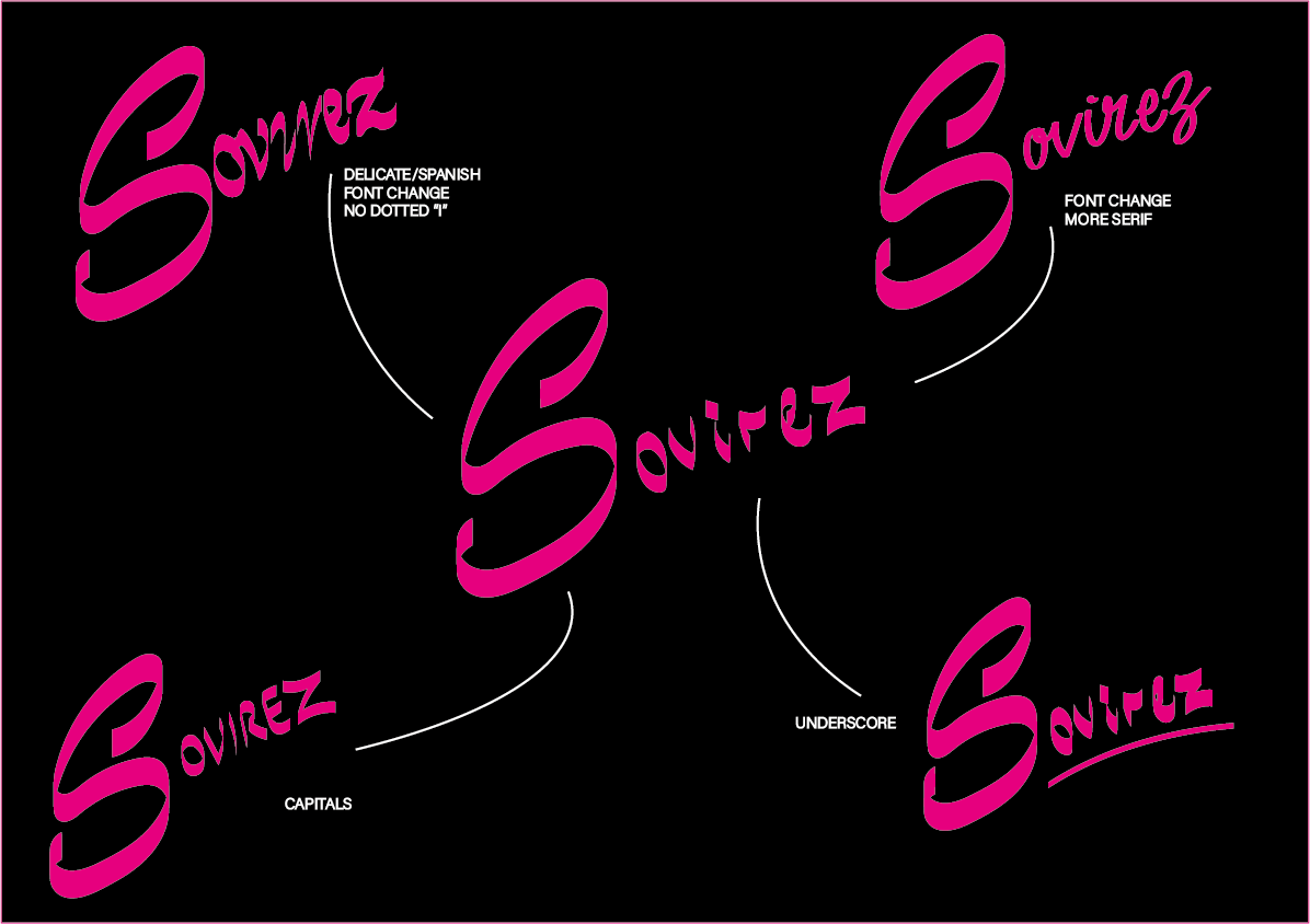
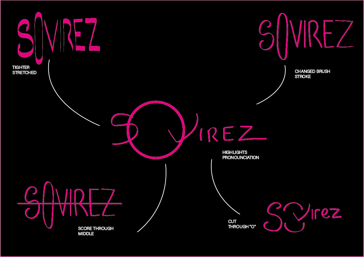
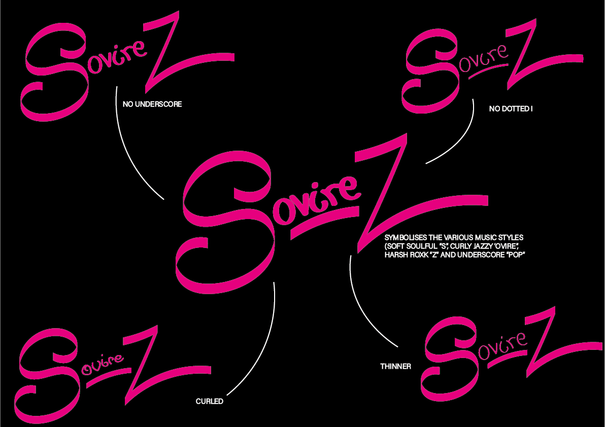

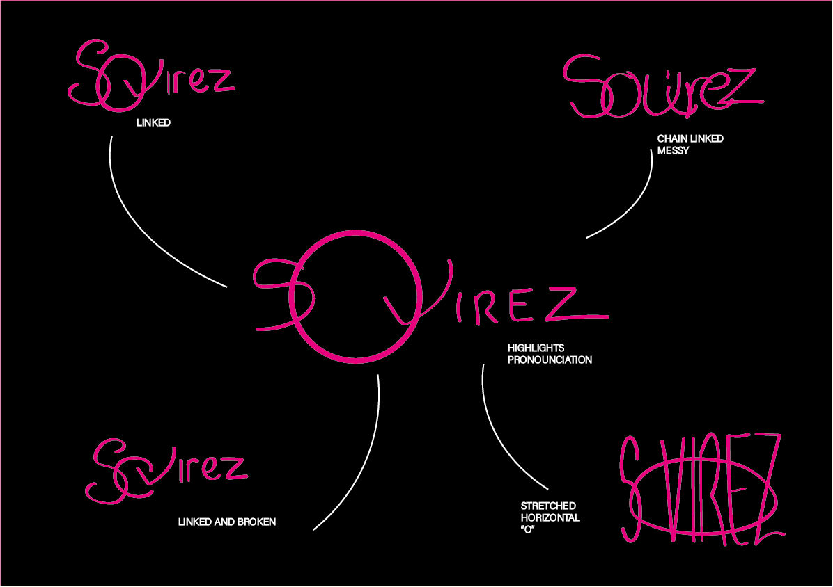
I then developed each of the designs with small labels showing what I had altered from minor to major edits.
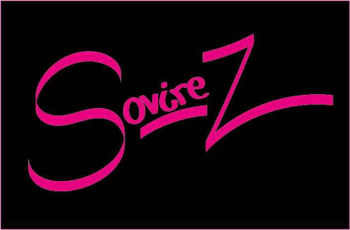
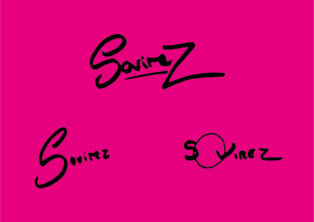
My client chose this one to take forward
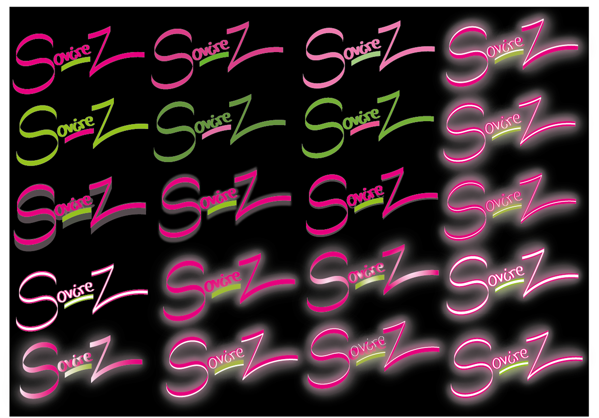
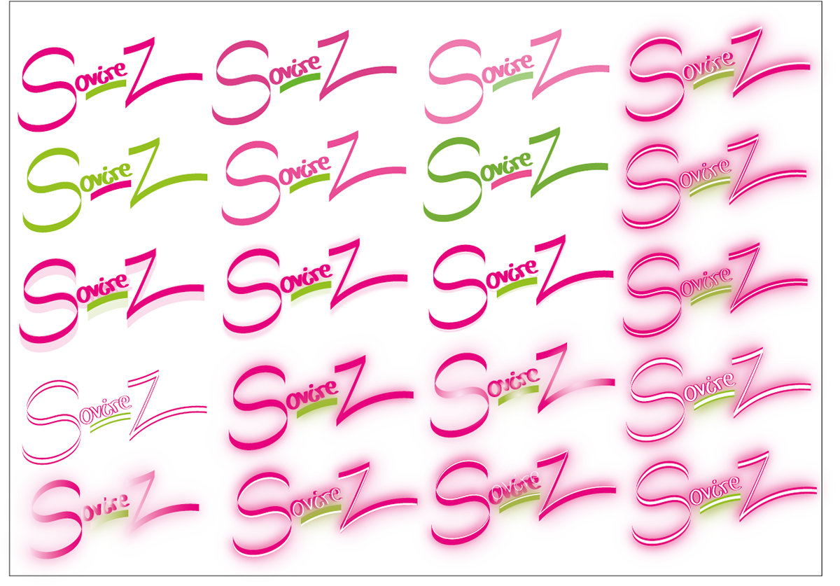
I then experimented with colours and effects implementing the neon my client had requested
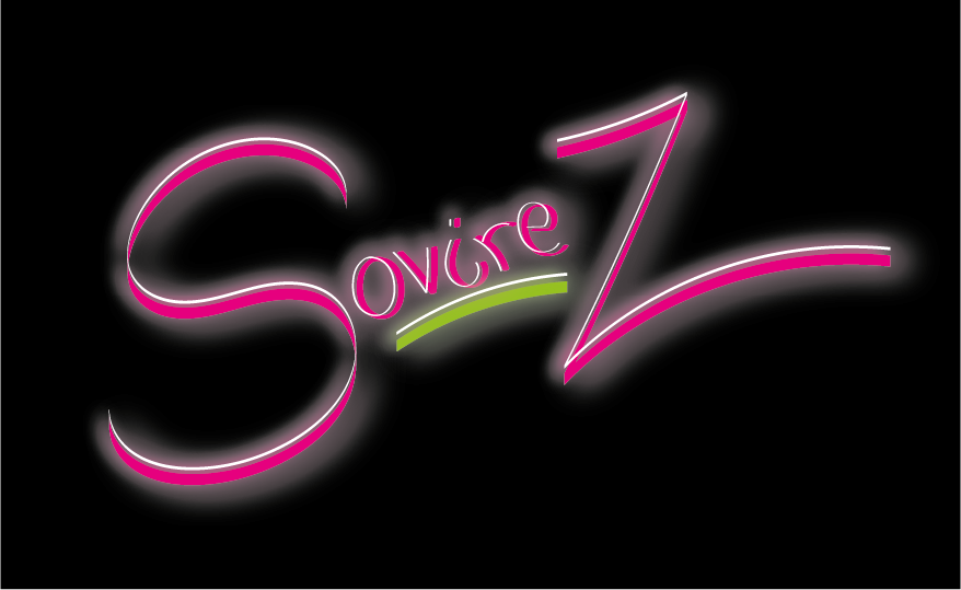
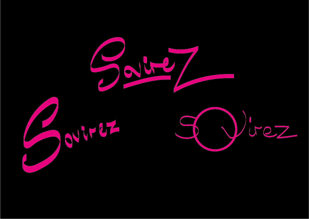
My client then chose this design from my developments with the request that the green could be changed for a more turquoise colour.
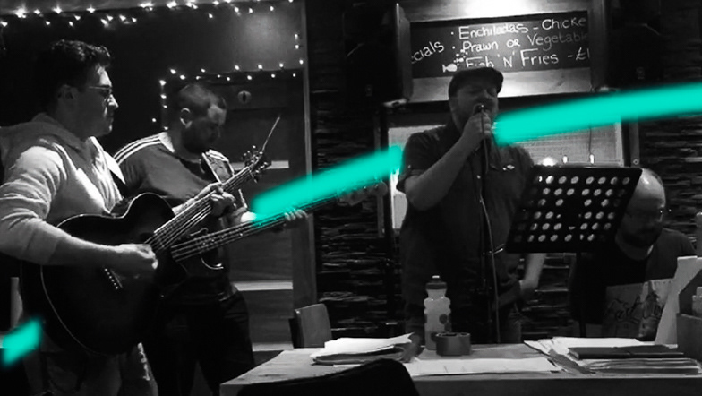
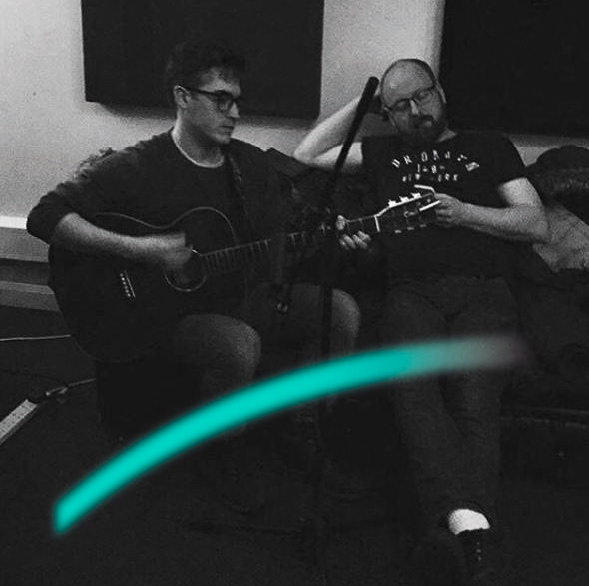
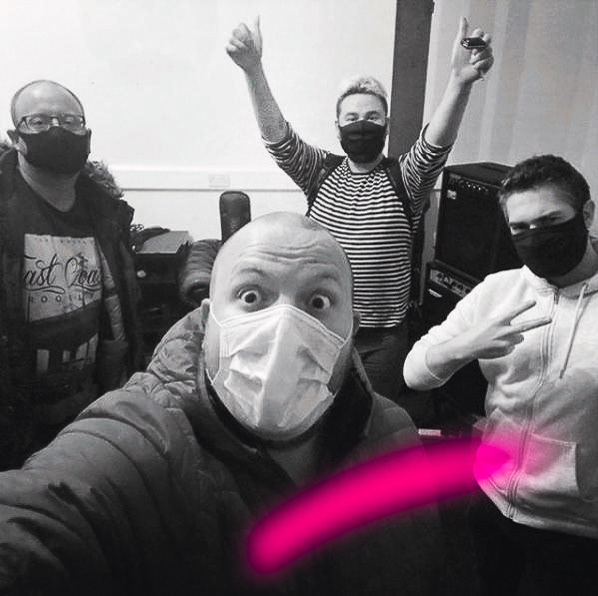
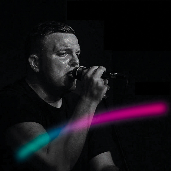
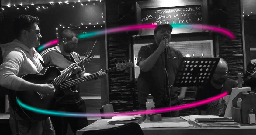
I also suggested for their social media and branding of their band to continue the fifth element of their logo : their neon colours as long as they didn't over use the effect all the time, I showed some examples of this in the photos they provided
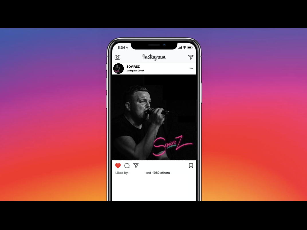
The logo represents each of their music genres that the band covers. the "S" is the smooth Soul style, the "ovire" is curly and playful suggesting Jazz, the sharp messy "Z" represents Rock and the "underscore" that helps the logo to stand out is Pop.