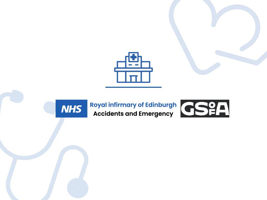
A service design and user experience project for the NHS looking at improving the A&E service in The Royal Infirmary of Edinburgh for both staff and patients using design thinking. Working closley in a group of seven we covered improvements in signage, bereavment, interior design, user experience and staff experience.
We travelled to the hospital from Glasgow and made our own way through the building to A&E getting lost on the way. We then mapped out the floor plan of both the hospital and specific department
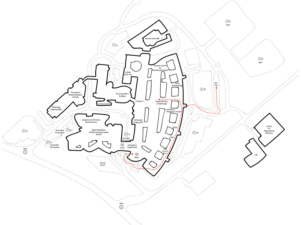
These were our maps shown above
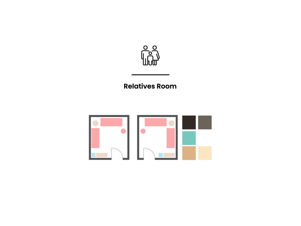
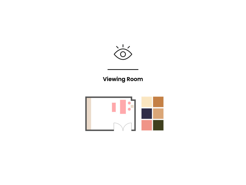
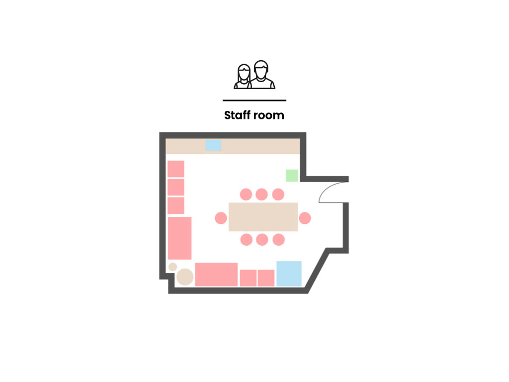
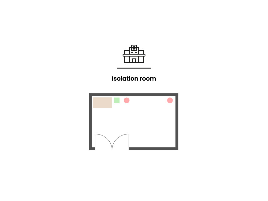
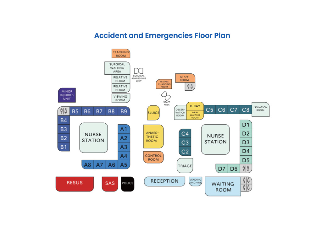
We then examined each of the rooms and mapped out their interiors.
(only the ones we chose to focus on are shown above)
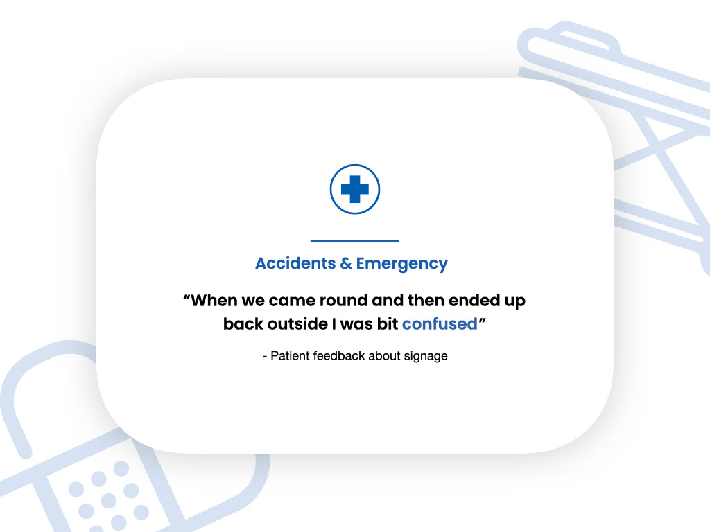
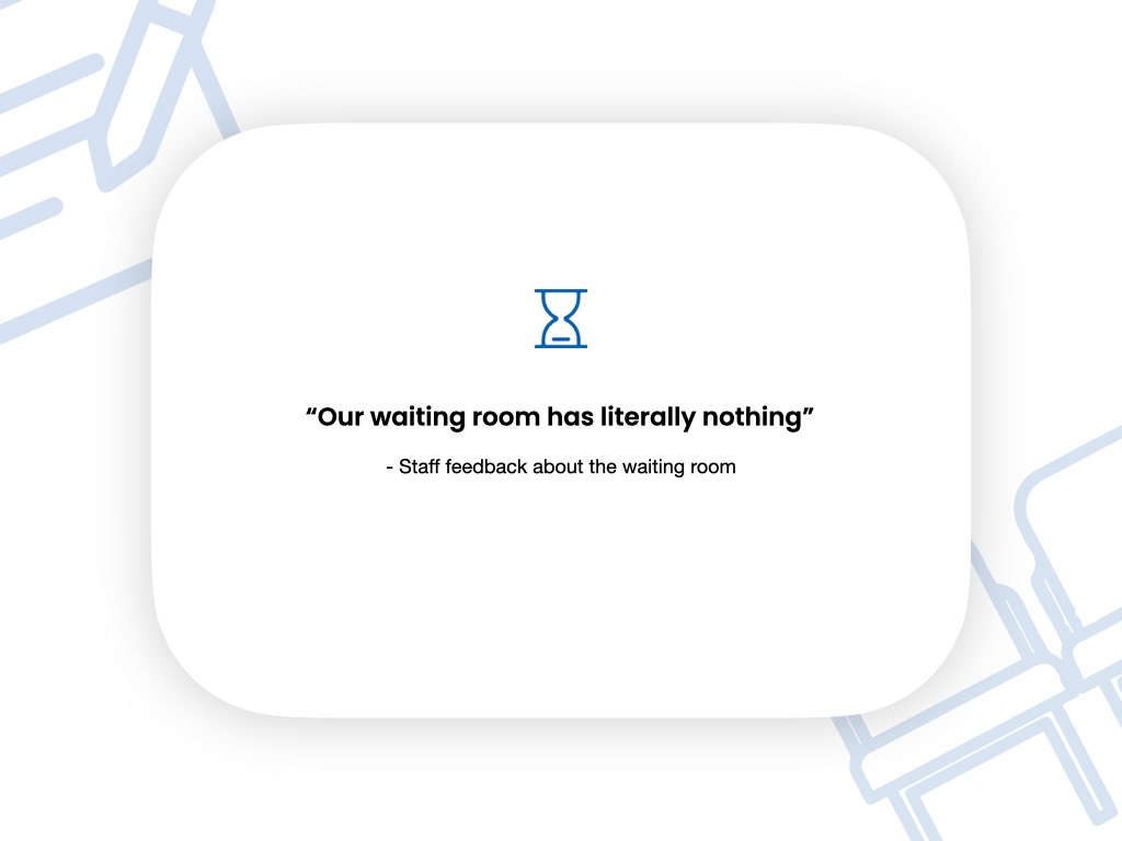
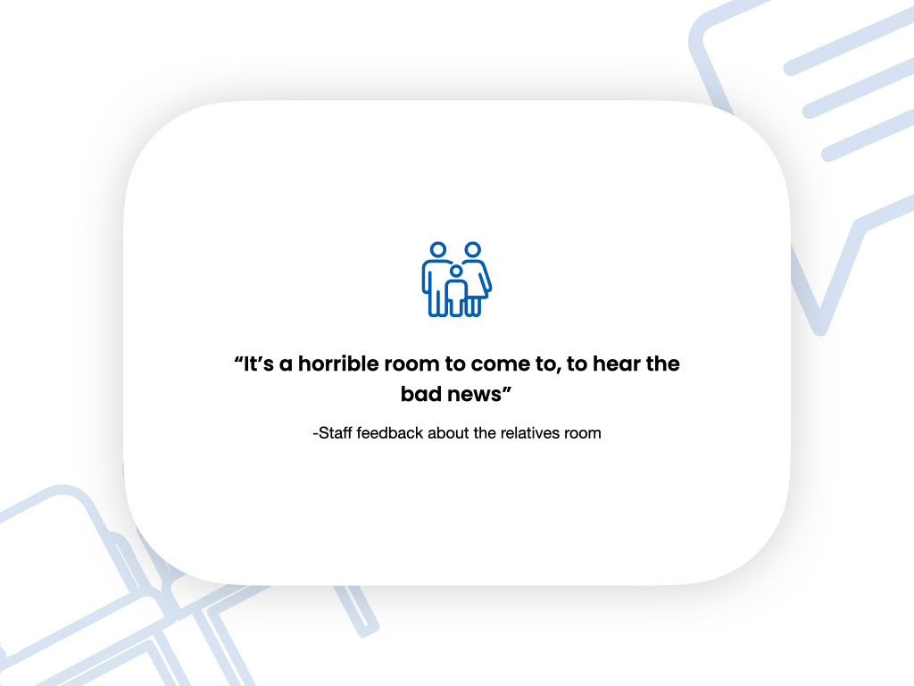
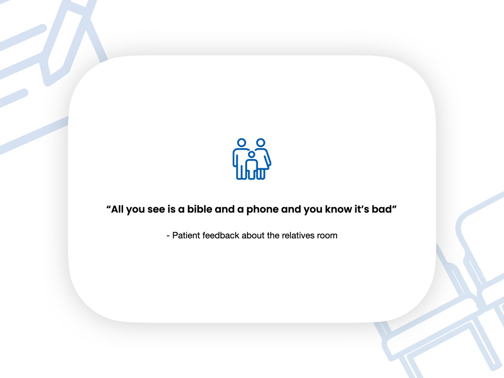
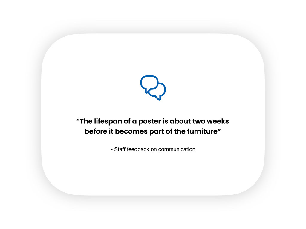
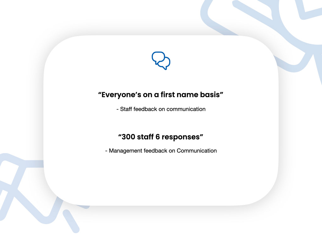
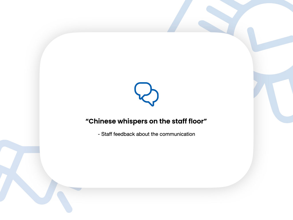
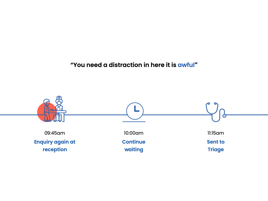
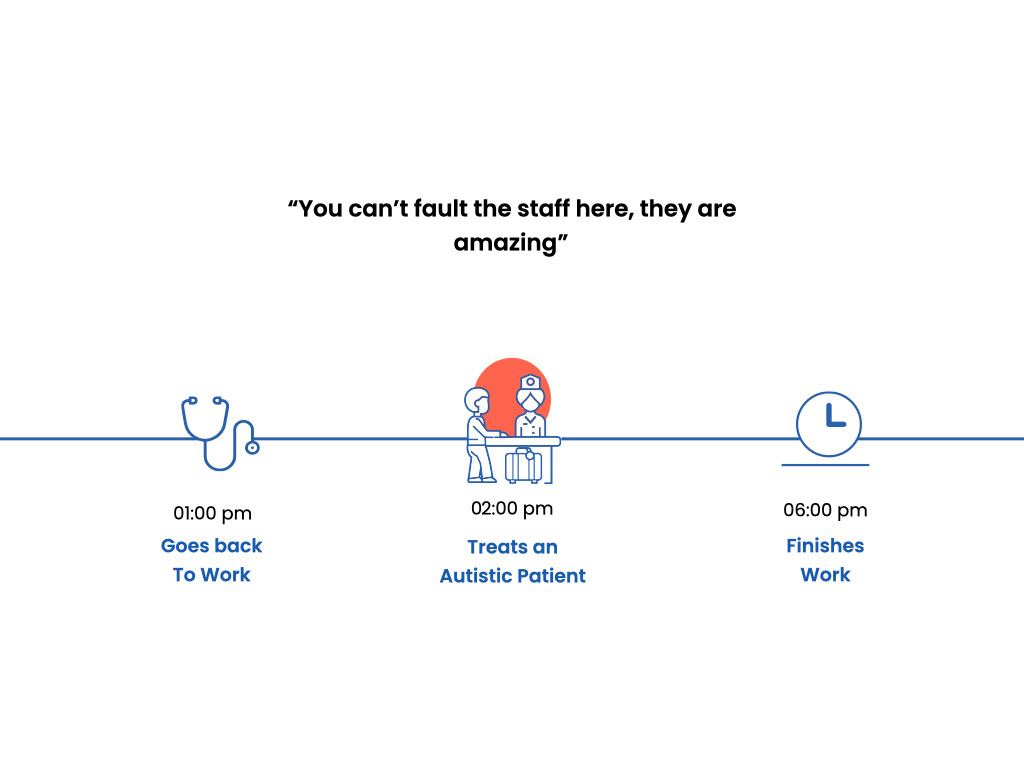
We also interviewed both patients and staff trying to understand what they felt needed changed and their overall experience in the department. Above are some of our key quotes
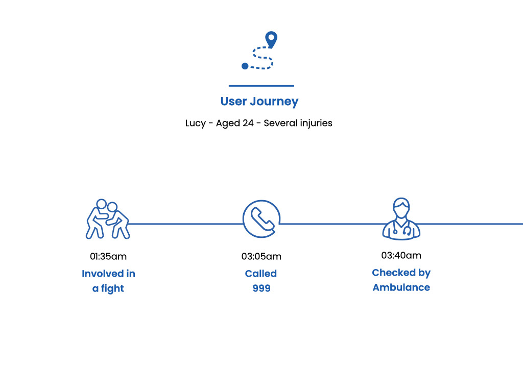
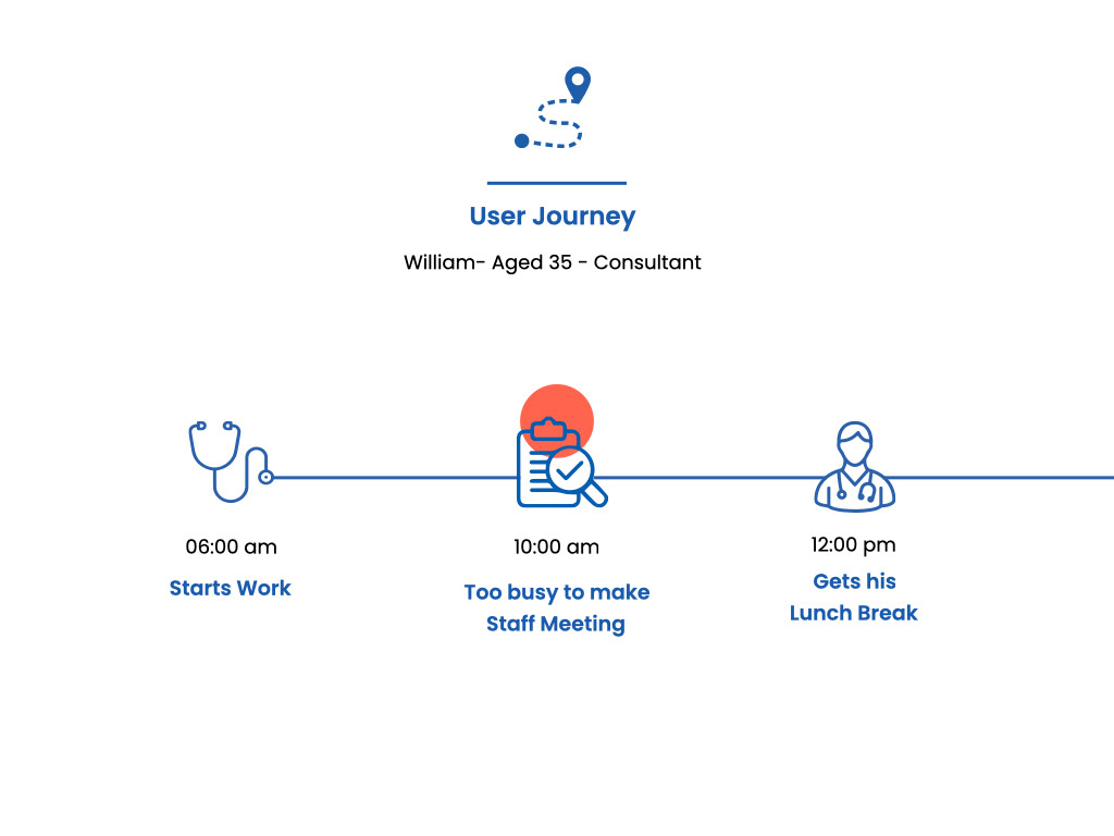
From our interviews we created user journeys that highlighted all the issues we would tackle and try to solve. There were so many and only 7 of us so we divided into smaller groups and took on separate tasks but made sure to keep up to date with everything we done reporting back to each other daily
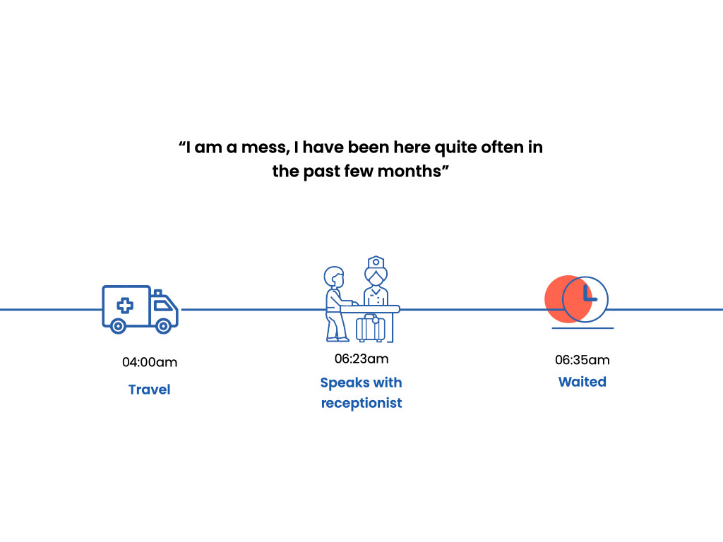
(our key issues are marked in red on our user timelines)
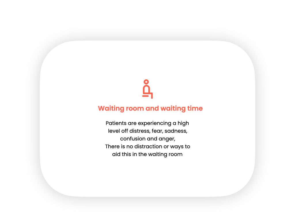
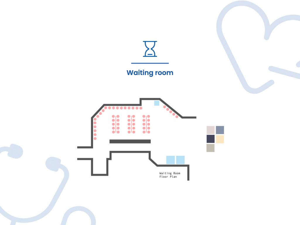
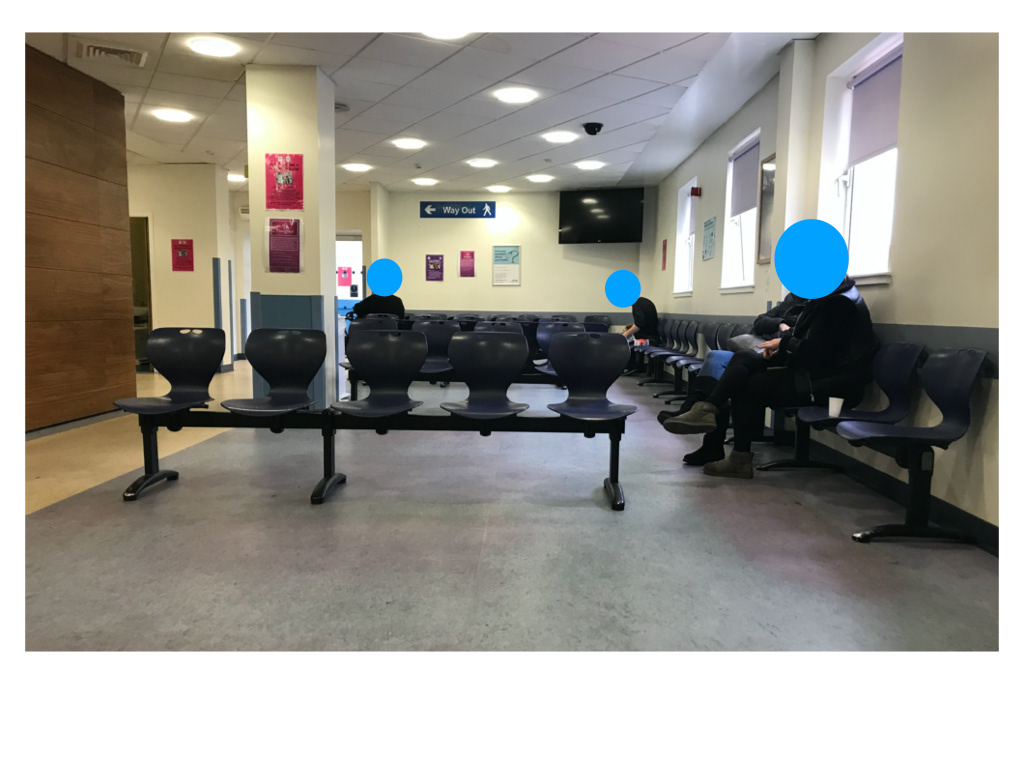
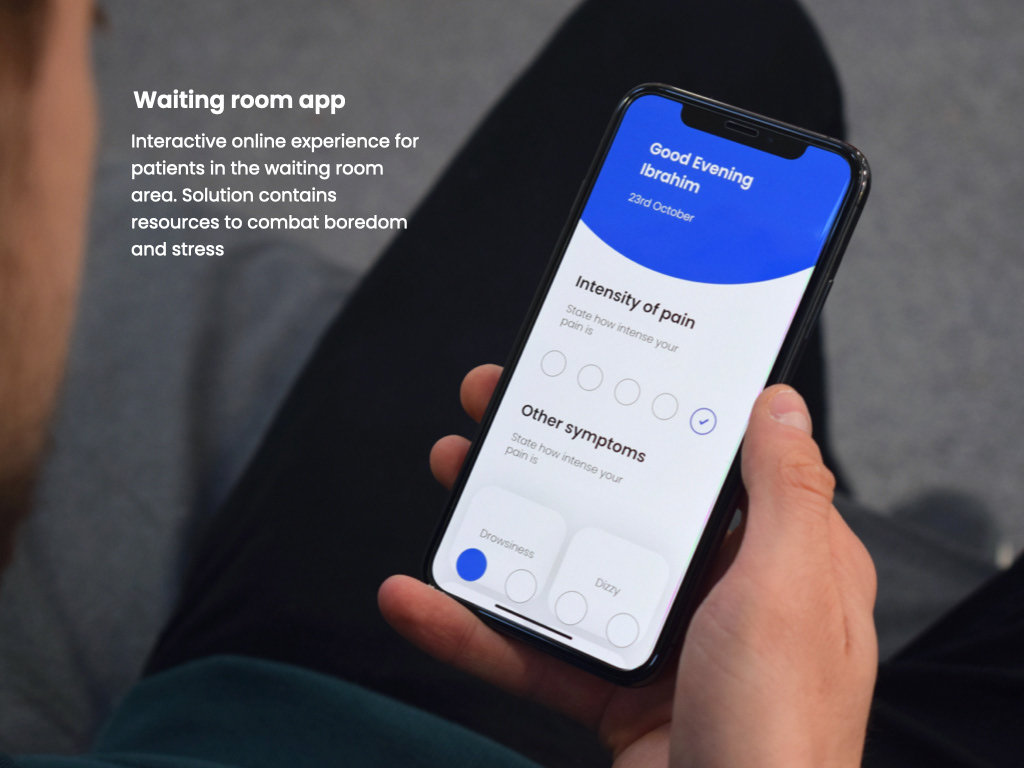
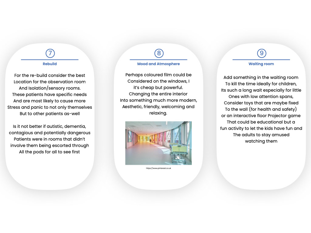
The waiting room was our first problem
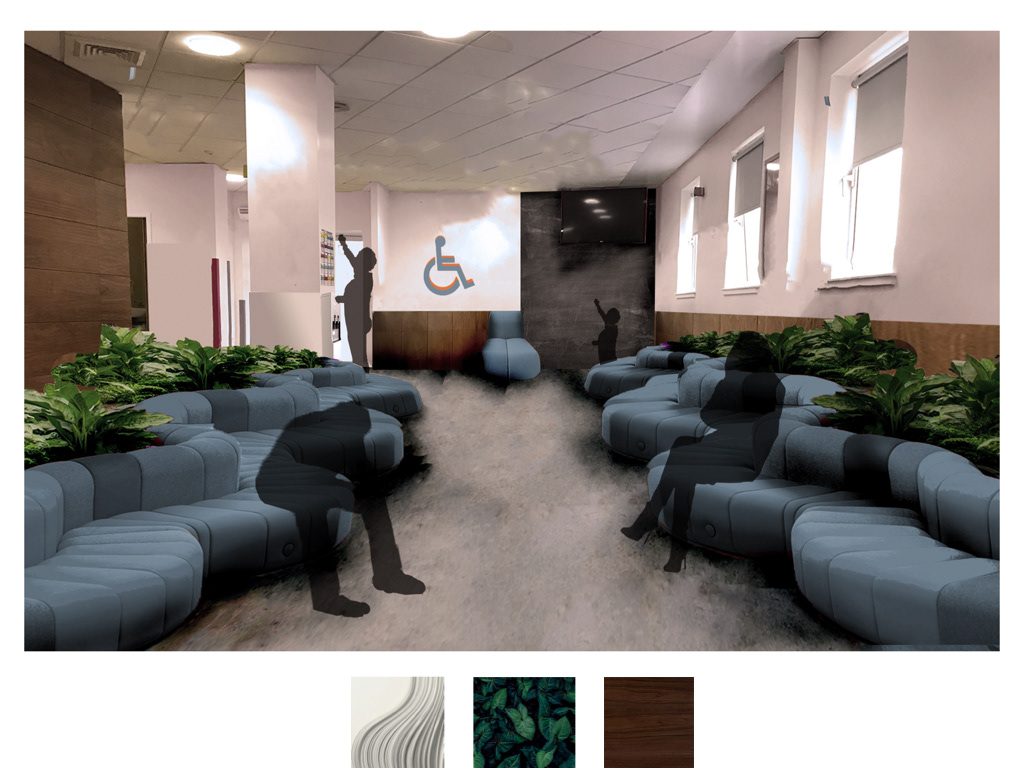
We redesigned it to have more comfort and life to it, amongst many of our changes we added information leaflets with the aim to re-educate patients that perhaps shouldn't be in A&E but an alternative such as GP or Pharmacist, we created flow to the room through seating giving patients a feeling of motion and progress, and we added more natural lighting to make it feel more comforting.
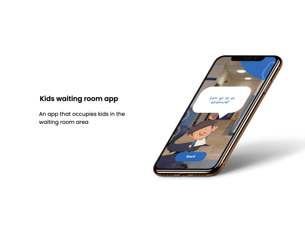
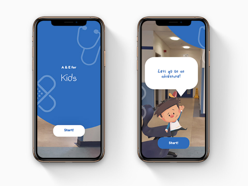
Another part of our team created an app for children in the waiting room, it not only kept them busy, it educated them on health and how to take care of themselves
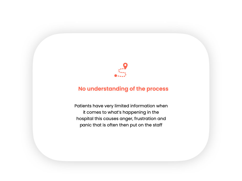
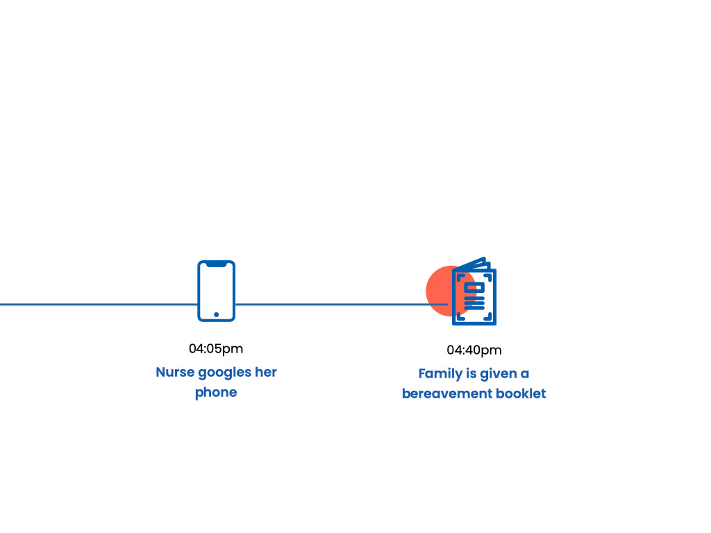
Continuing on our user journey, we found a lot of patients enquiring continuously at the desk on updates as they were often very emotional and were given very limited information
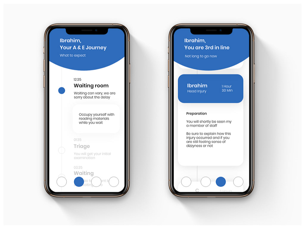
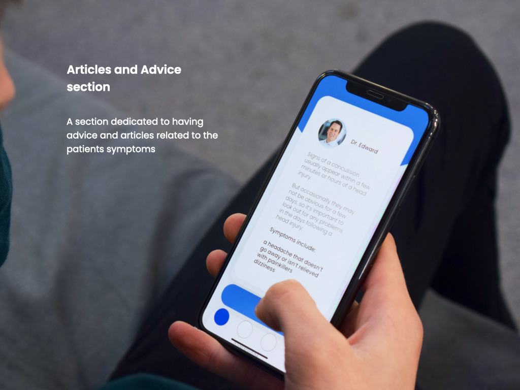
Our team created another app to solve this issue, it not only showed their triage but helped collect information for the staff member that would see them and gave advice on what they could do whilst waiting
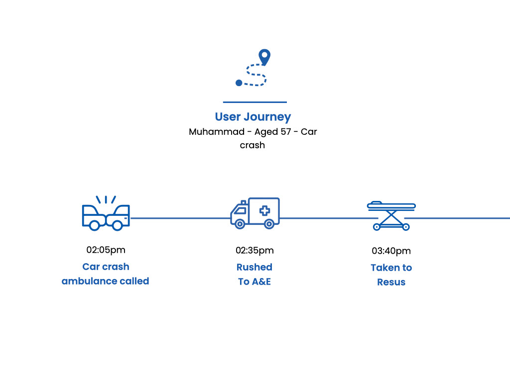
Our second user journey didn't wait in the waiting room and focussed on other issues
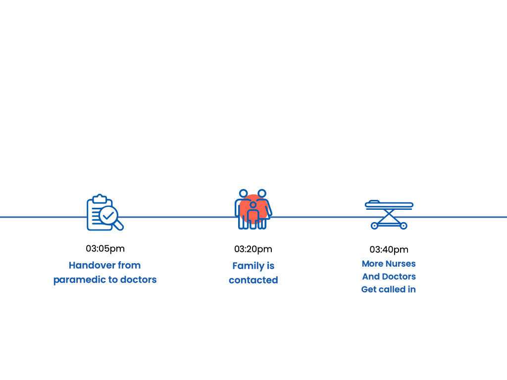
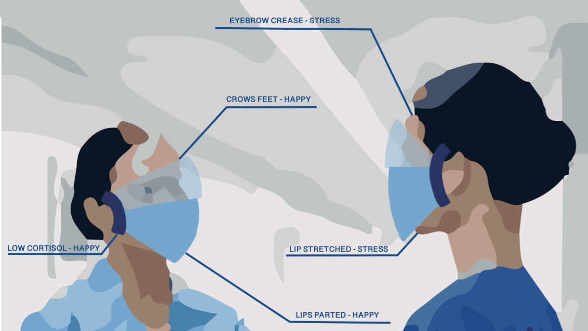
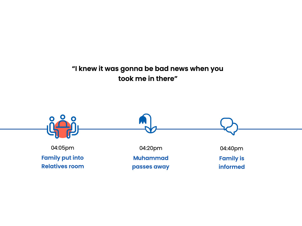
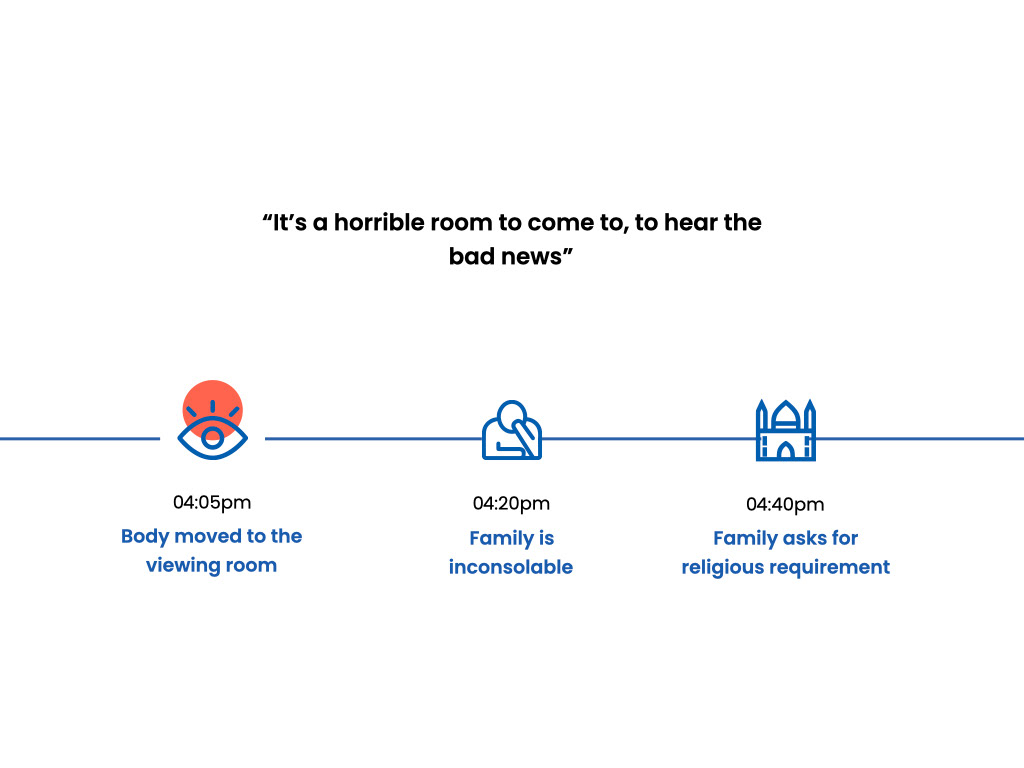
Often when a family is contacted about a loved one in A&E there's a hundred thoughts running through their heads the last thing they need is more stress
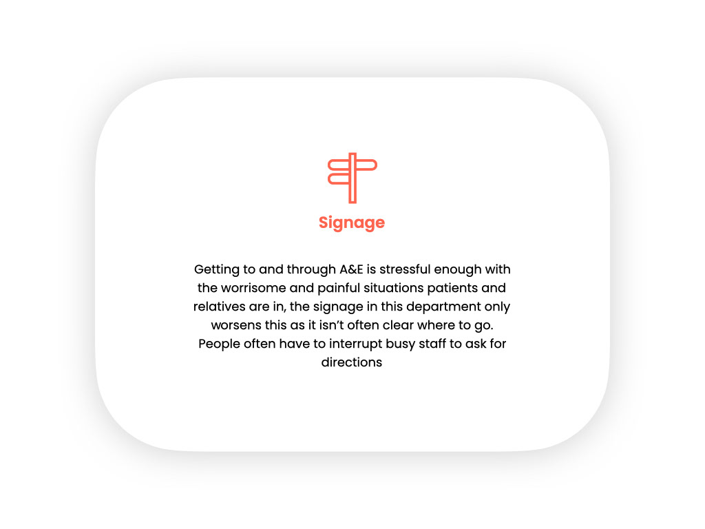
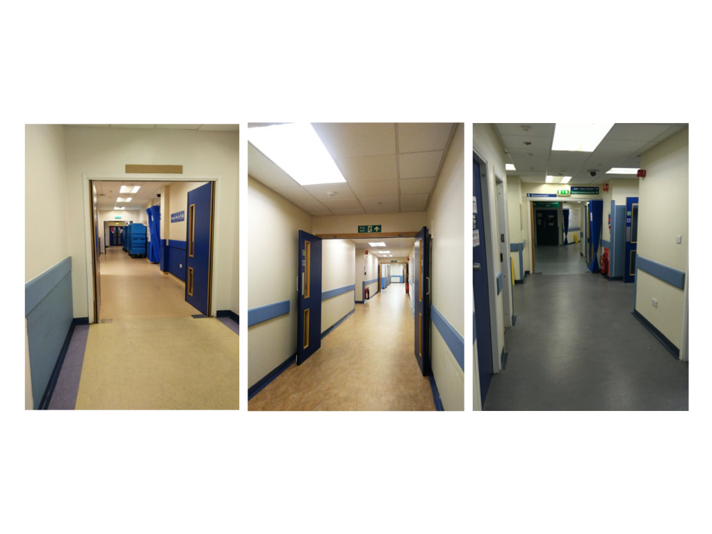
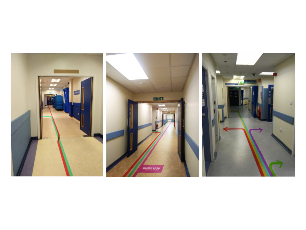
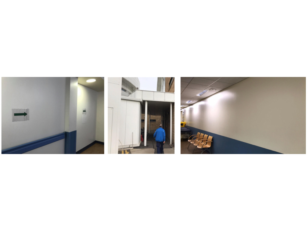
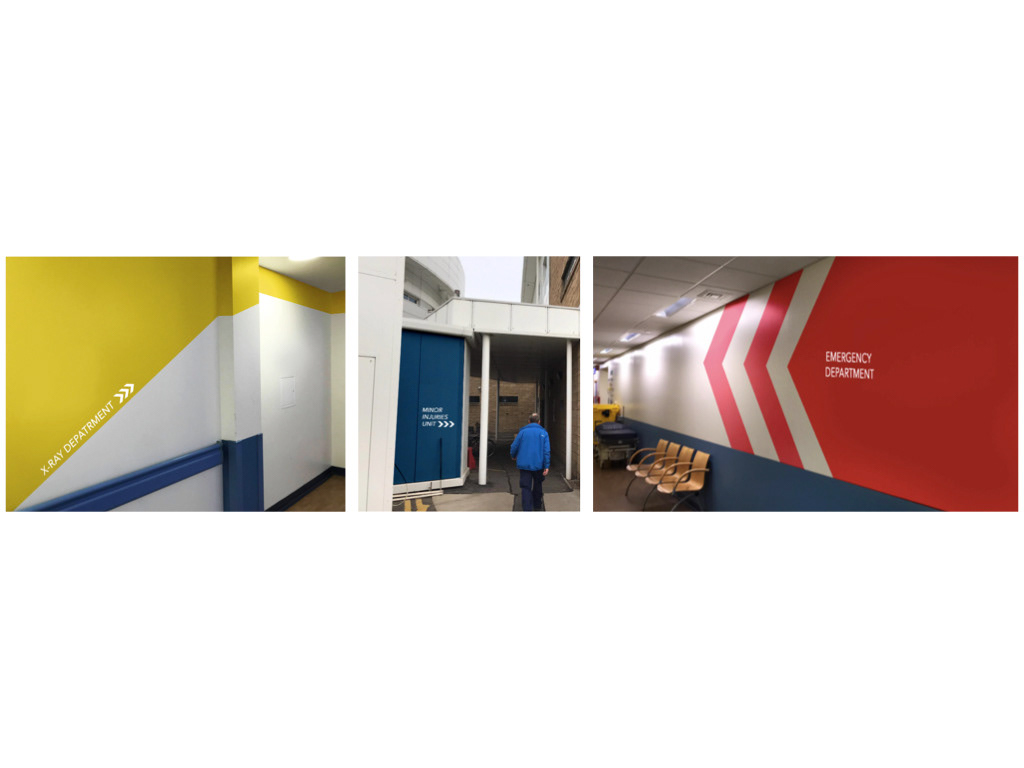
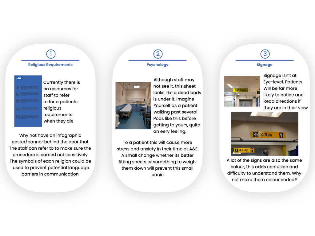
We looked at the existing signage and altered it in the exact same areas we photographed, we made it bold, added arrows and placed it where the eye's were already viewing rather than having users hunting for the signage.
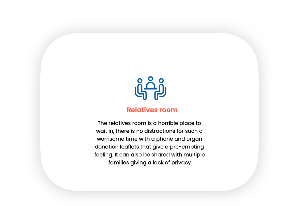

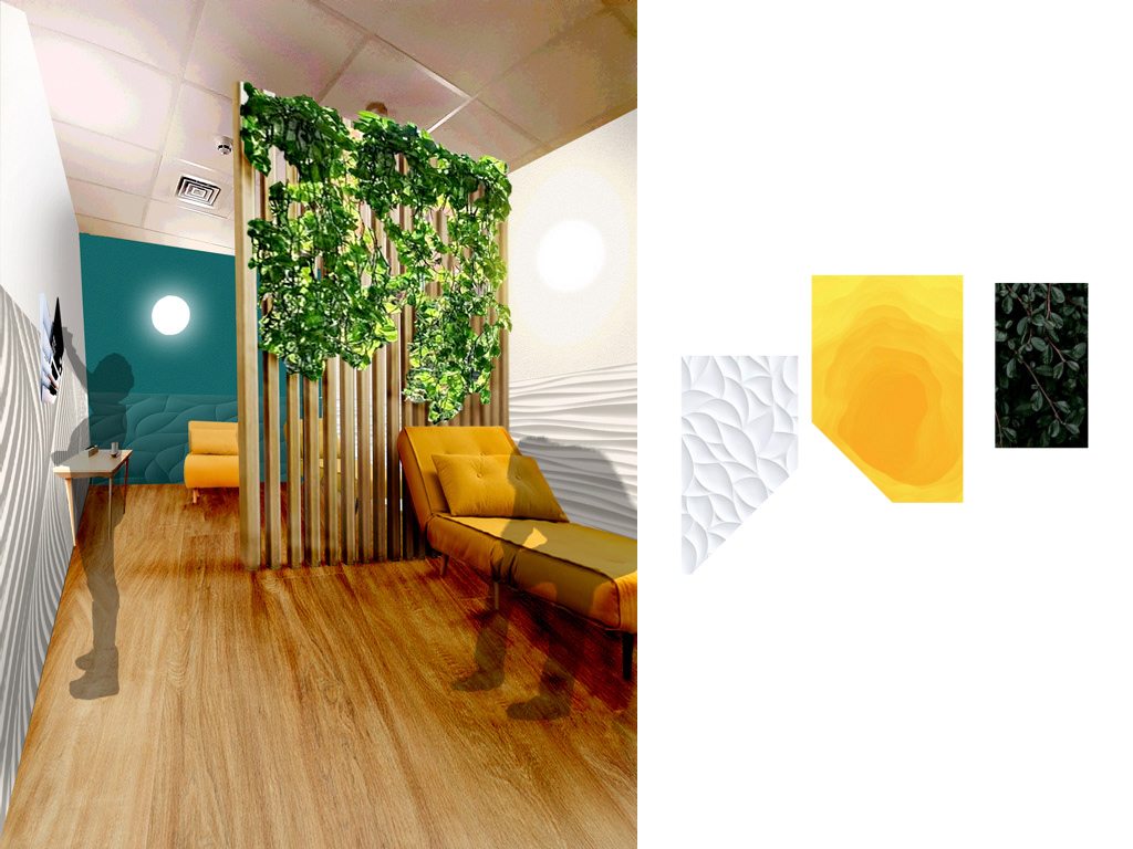
We redesigned the relatives room with a much more comforting and bright interior. We added a divider to allow for more privacy especially if there I more than one family in the room and added foliage to bring some life into the room.
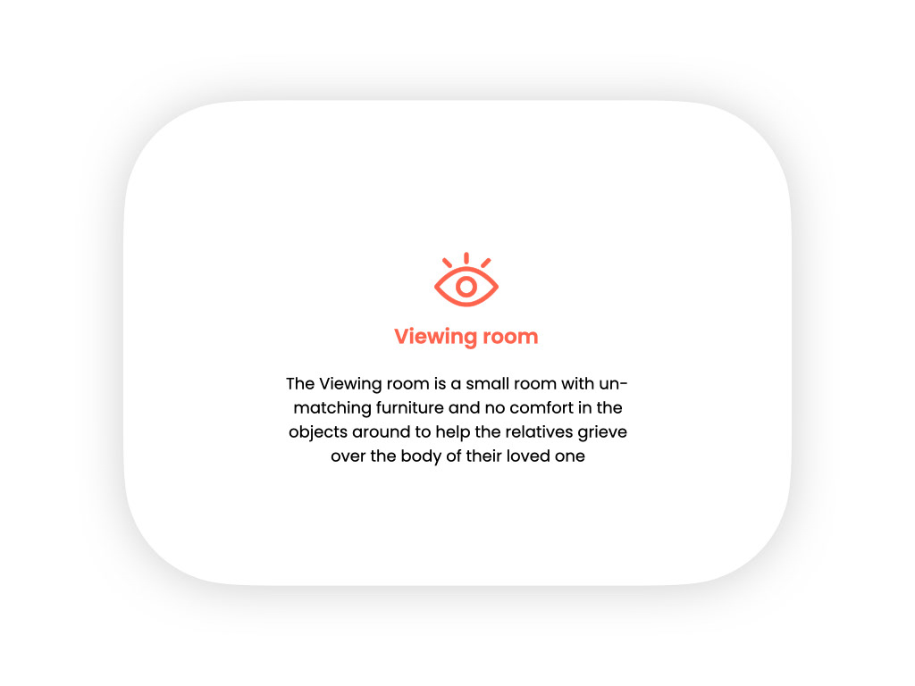
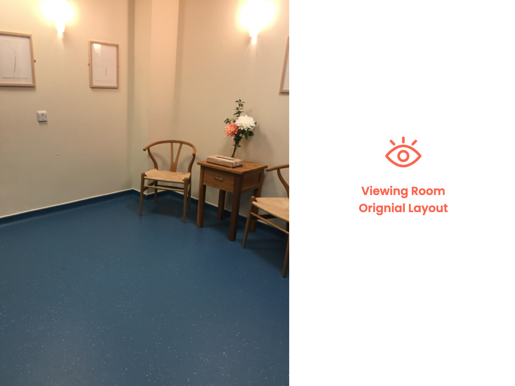
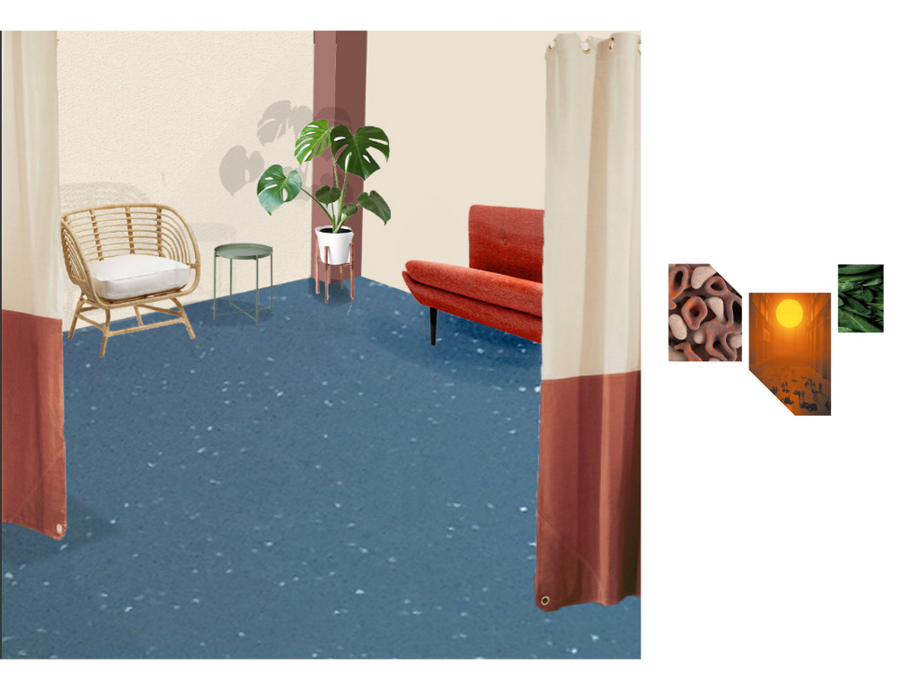
We also changed the viewing room to be more warm changing its tones to a more sunset aesthetic and foliage again to represent life
We then looked into bereavement and ways we could make this in any way easier for both staff and patients family
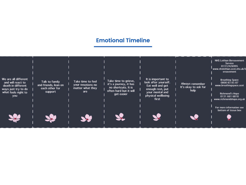
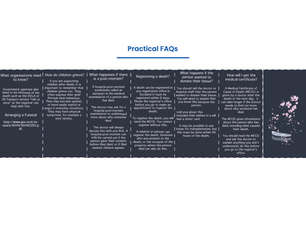
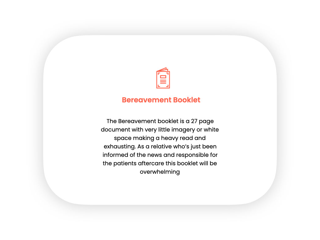
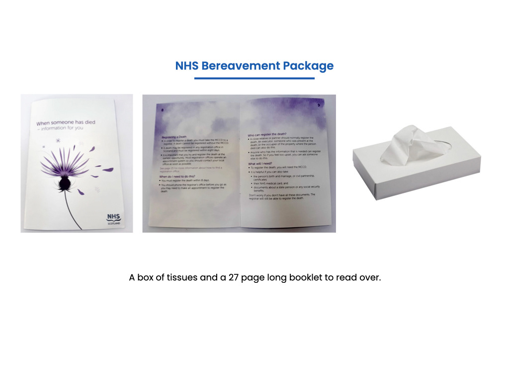
After talking to the nurses and what they often say and the things they have to mention professionally and the things they want to say to comfort we started to form an information booklet. This was also developed from out own research and the booklet that is currently given to the patients family
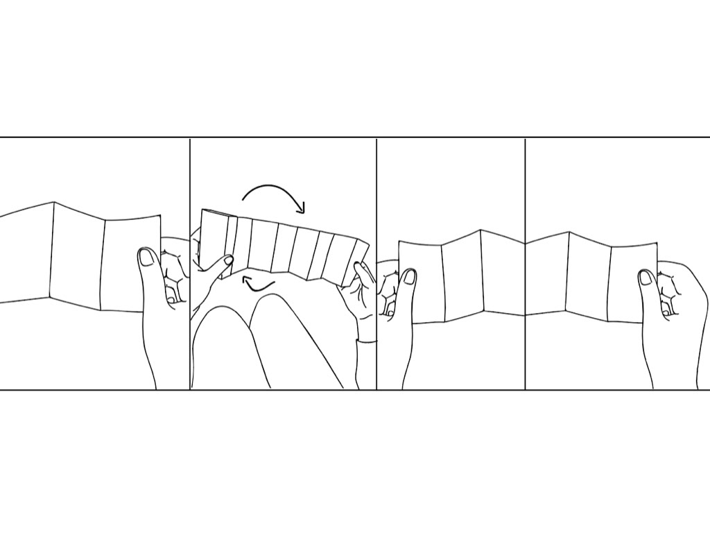
We realised that the information had an order and could actually be done in steps. Not only that but we realised that they could be divided into both practical and emotional
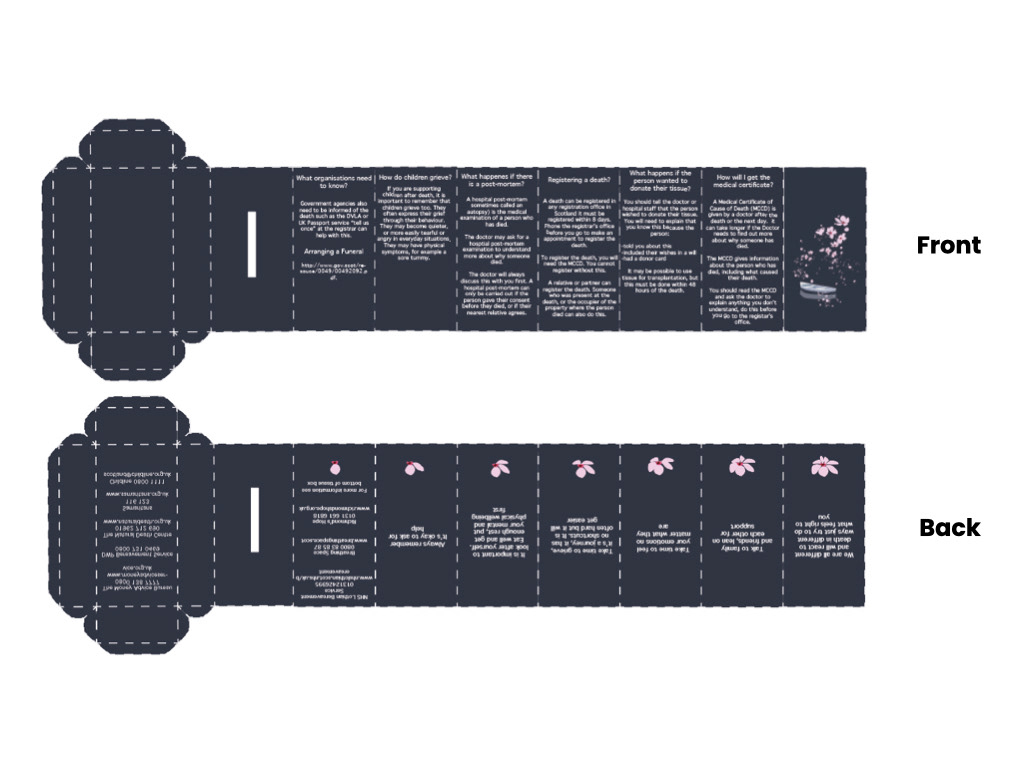
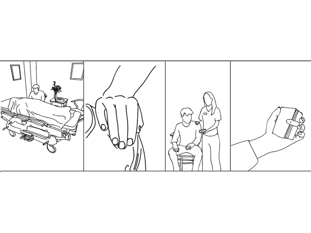
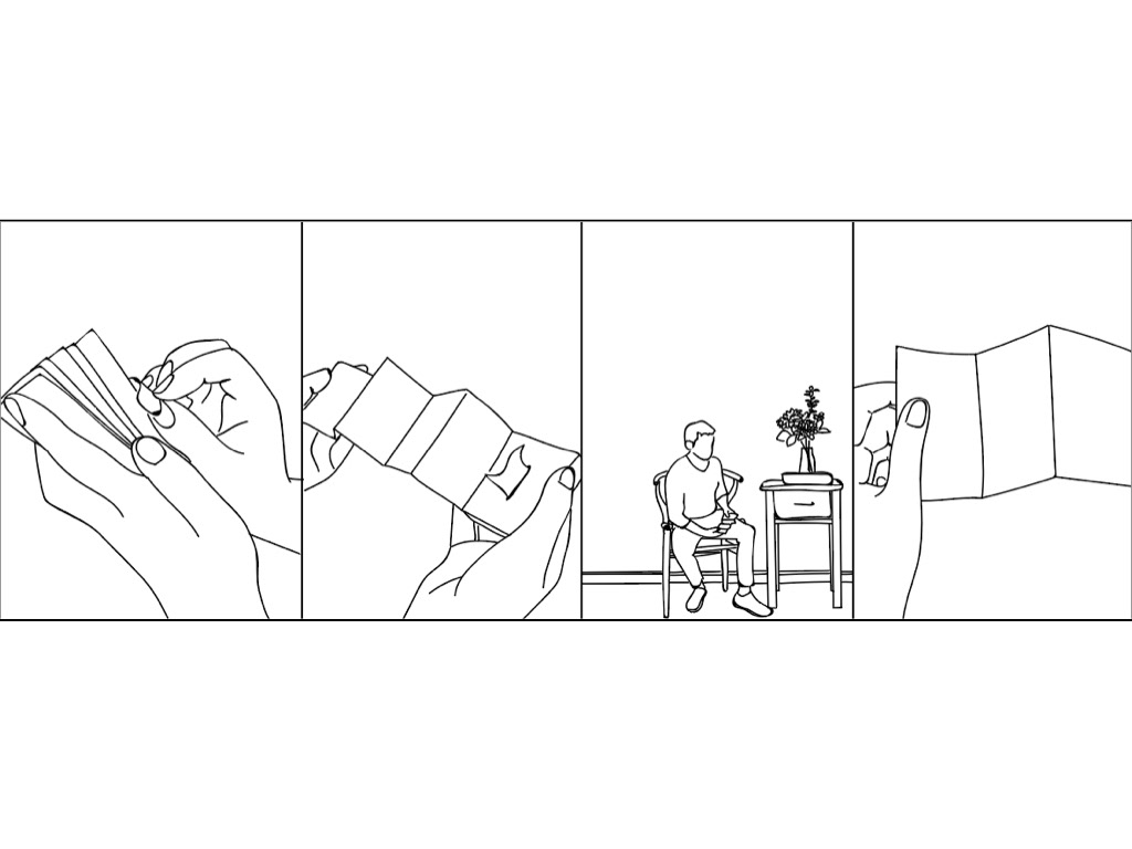
we implemented this figuring that although everyone will need to read the practical steps it should be the users decision whether they want to read the emotional ones. We also decided that they could rip off each stage as a symbolism of moving on or less things to get through in such a difficult time as they remove each step.
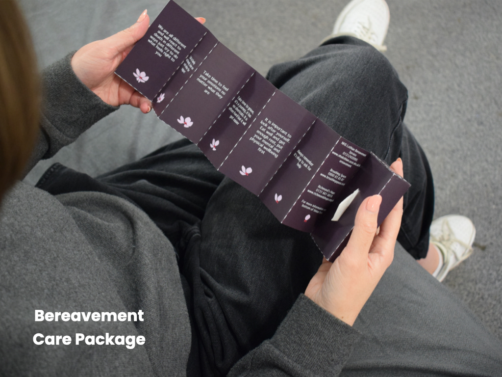
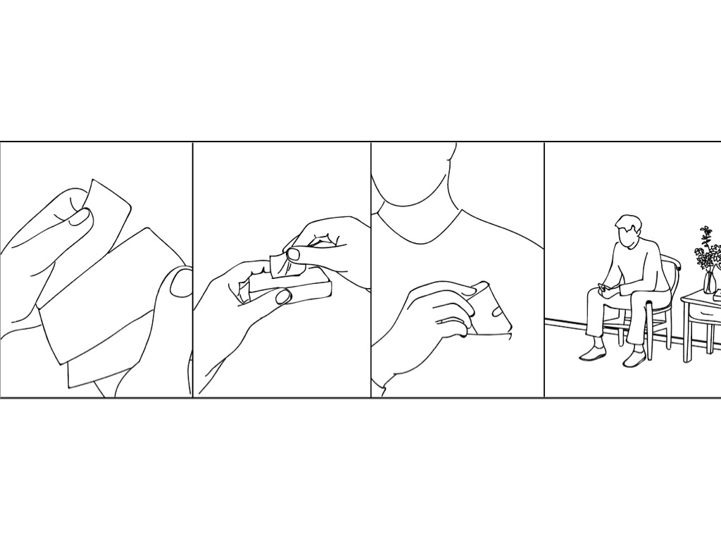
We also combined the booklet with a small tissue box: the two things the NHS give to the bereaving but brought together to become more of a warming gift to help them through the hard time. It was pocket size too so it was portable if they decided they weren't ready to do anything that day.
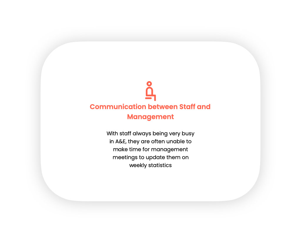
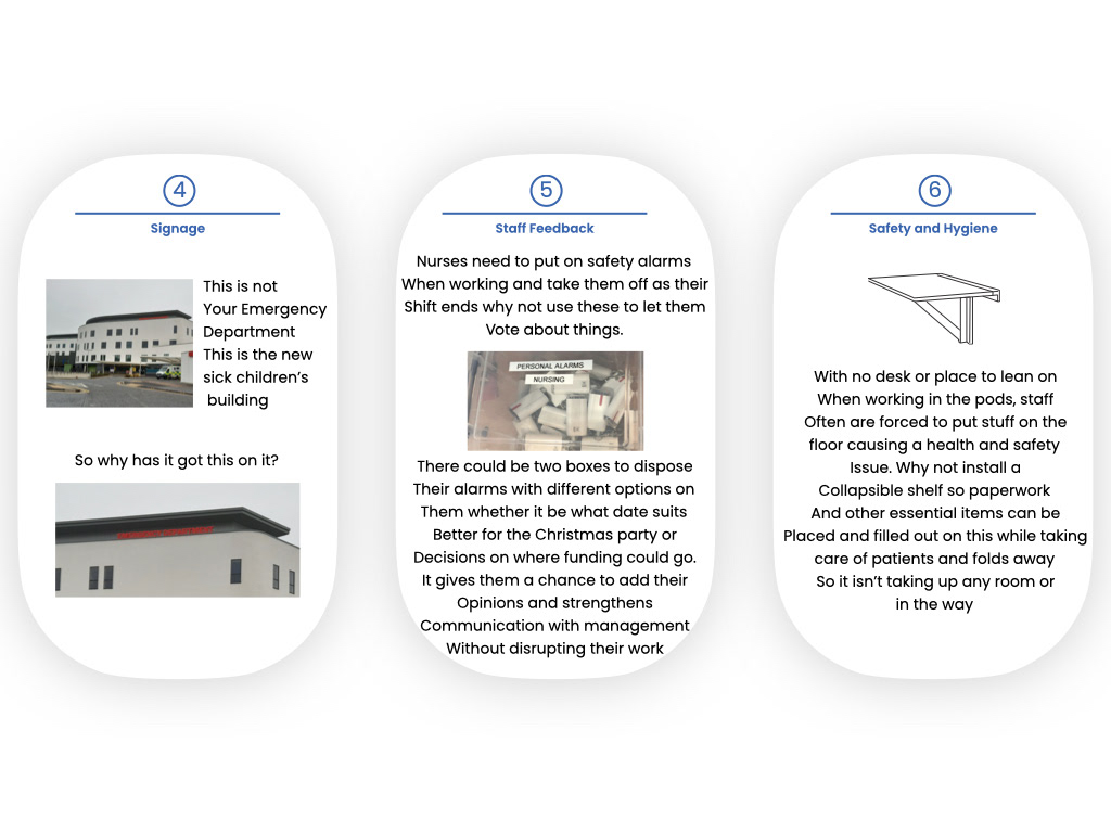
Another issue we tackled was staff not having enough time for all the weekly statistics. We changed the design go the NHS for the department making it a tree of life to allow staff to feel more part of a team.
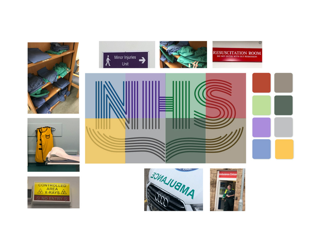
We also created this graphic, each colour represents each department of A&E. The idea was that the statistics for each team would be divided up so they only had to read a much smaller amount of information, if they were curious they could view the rest but for time it would be easier if they just needed to access their own.
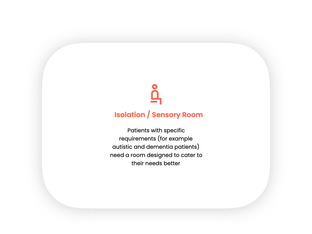
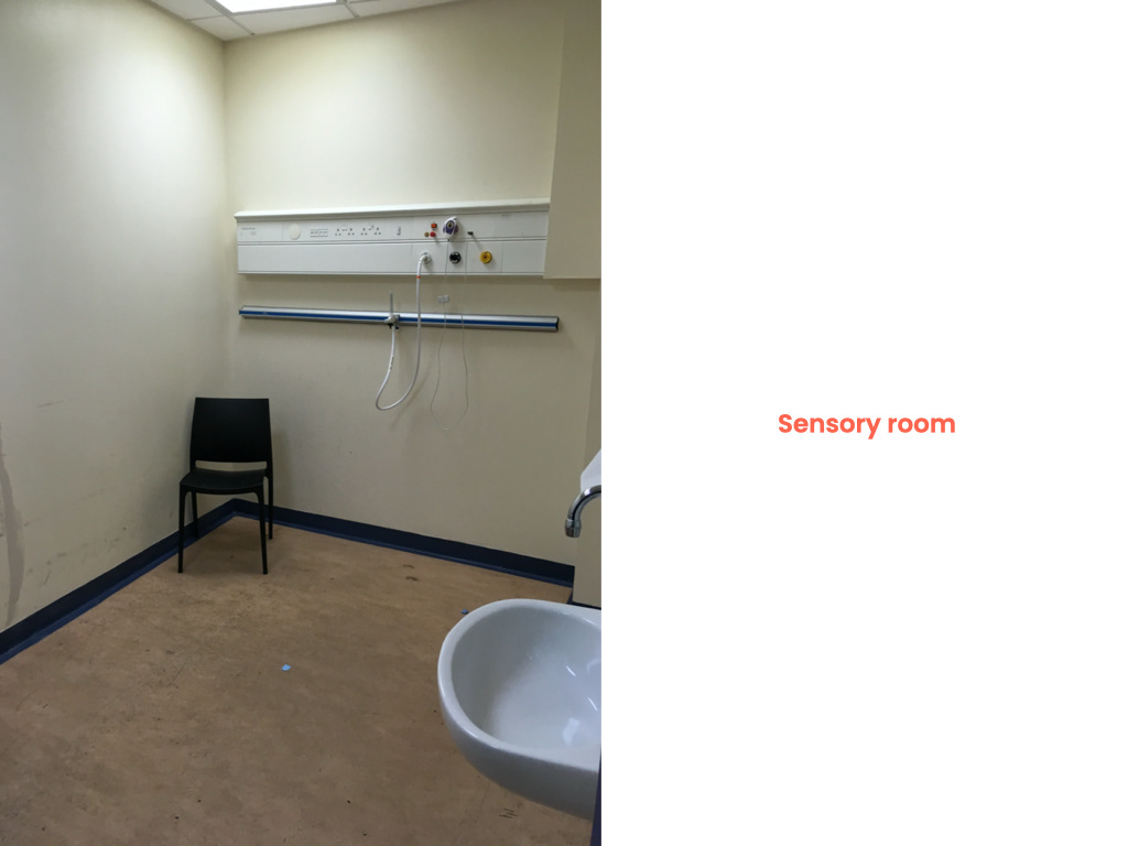
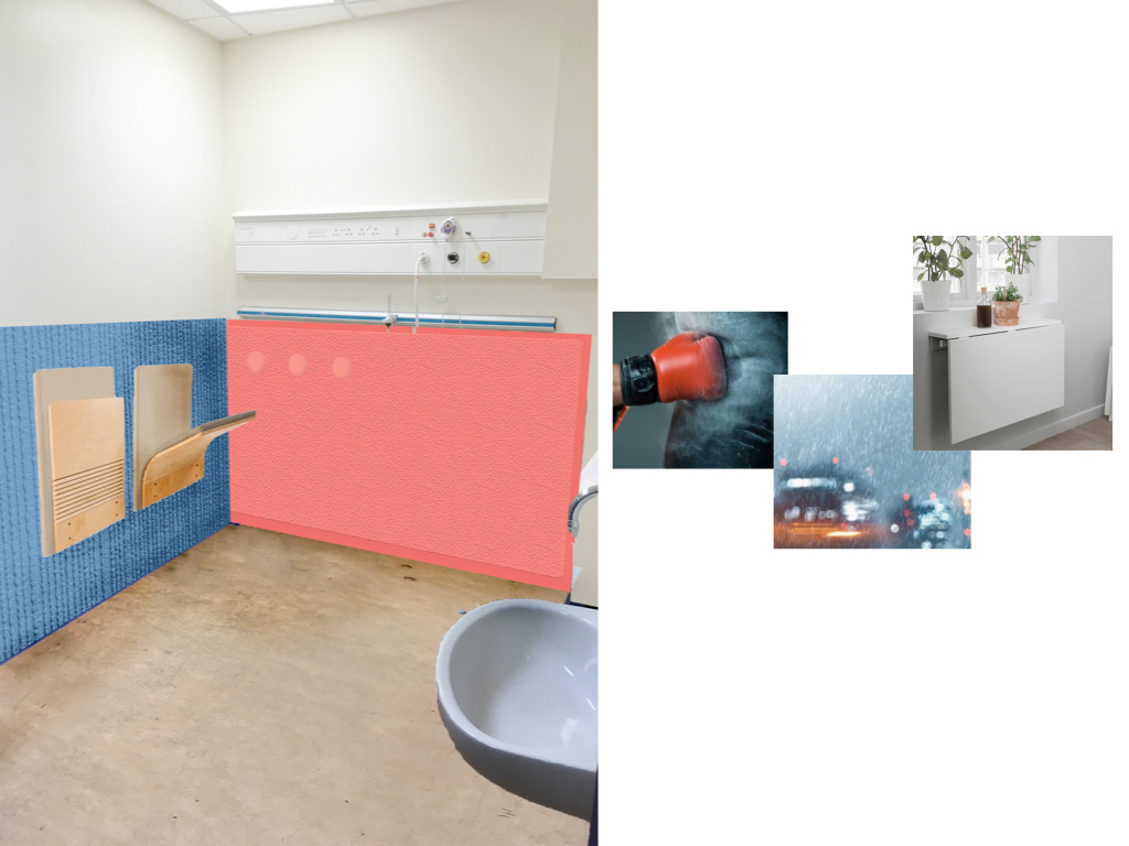
We created a more sensory room for patients with specific requirements. this room involved speakers, a fold out table and materials that were soft so intense emotions could be taken out easily and safely such as anger and stress.
We also provided some quick fixes for our NHS team to implement that could help them in the present unlike some of our concepts that would take a lot of funding and time.
I loved working on this project, I felt as though I was actually able to help others and had a chance to learn a lot from my peers. The NHS were very grateful for our work and felt we had listened to them and understood their most pressing issues